Posts

Showing posts from October, 2019

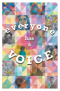
TO BRING YOU THE NEW-S

Image
Theoretically, one ought to have something to SAY. I am going to make a newsletter. Here is a basic outline to get me started. 1. Who is my audience? Students. My audience will be primarily students and geared toward them. I will, however, be keeping in mind that other faculty members as well as administration will likely see/review/read the newsletter. Parents too, maybe. So I'll be keeping it trĂ©s profesh. 2. What is my message? There will be some review of what we've done so far this year in school and things to look forward to. Also some artist features (student and contemporary working artists) and perhaps a little bit about the teacher. Perhaps. I watched/read the following tutorials on Adobe Help Center to gather some seeds of information: Creating a newsletter-  ⌘D = "drop in".   V useful. Also some bits and bobs about auto flow and semi-auto flow when dropping in large quantities of text. Furthermore, by way of observation, it seems like a pretty

Layout of information.

Image
Why does art matter?  A broad overview of color and form in the paintings of Matisse. I chose Easel.ly for my Infographic. I looked at each site and contacted a few to ask whether they were compatible with iPad. They all said not. (Except one who didn’t answer me.) There were several places online I found people who had worked in Easelly on their iPad so I gave that one a go. I sort of figured that if I liked it the cost is only $2 for a student subscription. I did not like it; the free version, at least. Also at that point I was too annoyed to want to give them my $2 and then remember later to cancel. Blargh. I got through the layout and lines drawn and became fed up and bailed. I took a screen shot of it and finished it using the markup type tool in the iPad’s Photo app. No joke. Easelly was pretty finicky and every little tiny movement of my pencil made the objects object. (Haha.) If I was going to be making Infographics on a regular basis I’d really have to be able to u

FEAR OF

Image
Got it? What are the similarities between the artists interviewed in this article?  What are the differences?  All of the artists featured and interviewed in the articles are involved in the creative process: writing, interpreting, facilitating, making art and music etc. It would seem to me that any differences are rightly synthesized through connection to bring a bigger picture to life. There may be failures specific to each discipline, but overall it is wise to note that no artist is alone in their experience of failure. If we know this is a universal language, we can have meaningful, robust conversations which ultimately benefit the art world (Ahem! The world, period!) tremendously. Is there anything discussed in this article that you can relate to?  Fears are lies. If I listen to my fears I’d never leave the house. Gosh, even the house is a scary place, really. The thread of perseverance throughout the articles was something I can relate to. There is so much talk in the world a

The Big Beautiful Beak.

Image
Art is about survival. “Our purpose is to show how the brain reality even overrides the objective reality.” There is some magical place where science and art can commune. The art speaks and the brain interprets. What if there was a way to get the brain to tell us the secrets of art: why we make it, what is its true value, what effect does it truly have on us both physiologically and emotionally? This fella, Ramachandran was my favorite. I’d like to maybe have a cup of tea with him and have a little chat about neuroesthetics. Why not? Anyway. Ramachandran believes that the purpose of art can be understood by knowing its effect on the human brain. Why are some works of art so powerful? It is evident throughout history that there is a deliberate hyperbole in art that seems to produce a pleasing effect on the brain. Our vision and visual perception are integral in our survival and even our well-being. About the birds and the woman of Willendorf! Something that is so necessary to o

InDesign. GO!

Image
Framey! An initial, cursory, study of Adobe InDesign leads me to the following conclusions: I want to make a printed book. I don’t know what EPUB extension means. Adobe Stock might be cool but its design-y not fine-arty. “Text styles” sounds a lot like “textiles”. Facing pages is a useful layout option. For my book. T key on the keyboard opens the type tool. Layout happens in “frames”. Escape key activates the selection tool. Drop image in at 100% or click and drag to specified size. Shift key to constrain proportions. Center circle = content grab. W key to see/not see frames. Type! Type can be shifted and moved easily. I am learning a new language. Character style = specific. Paragraph style = larger portion of text. Text style applies to character and paragraph. Named grid = apply to frame grid. I learned that reading step-by-step instructions is not a good fit for my learning style (hands on!) and I’ll have to refer back to tutorials once I’ve found myself in need of the