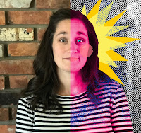
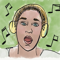
would I EVER use an image that I know nothing about
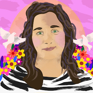
Inside/Out. Two portraits (self) in the same program (illustrator) with vastly different results. One made only out of type and one with all kinds of colorful goodness. The typography portrait was pretty straightforward and is made up completely of sections of (you guessed it!) type. I used a section of dialogue from Les Miserables, the novel by Victor Hugo, to fill in sections/planes of the image to create dark and light. This, in turn, gives the illusion of depth and shading The color piece is also created in Adobe Illustrator. I began by building the image with a series of shapes made with the curvature tool. I built them up piece by piece to make the basic shape of the face and neck- but with two separate pieces I was able to create a shadow under the chin. The whole piece is mostly built out of shapes created with the curvature tool. I built up varying colors of skin tone on the face for some dimension on the nose, cheeks, chin and forehead. The paintbrush tool wa...
