Posts

The Opinion Page

Image
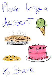
Bring a Dessert to Share (2019). What do you think about the process of creating your portfolio and website?  I enjoy it very much. But. And this is a big but. Haha. But, but-  IT TAKES FOREVER.  FOR EVER. Seriously, no joke, add up the hours and I’ve spent days working on these puppies.  DAYZZZZZ. There are so many variables and options and endless possibilities. Constantly redirecting myself back to simplicity is an uphill battle and I’m never quite sure I’ve arrived at a state of finished. I like working on my portfolio and letting it evolve over time. One thing I really like to do, which helps quite a bit, is to draw layouts and build physical mockups for my portfolio ahead of time. Its good to have a tangible thing in my hand to refer to, especially when I’m wondering what-the-heck page I’m on. What is your opinion about the the tools - comparing InDesign to Wix?  Being a totally blank slate, InDesign is somewhat more intimidating in that I fee

KNOW YER TOOLZ PART TOOOO

Image
Student Work What challenges did you encounter while creating your portolio and how did you overcome them? There were so many challenges. ALL of the challenges.  This portfolio took a million hours to put together. There are several masters in that puppy as well as oooooodles of images and a boatload of text boxes. The spacing and layout were a bit fiddly, but overall it was a gratifying task. One challenge is transfer of muscle memory (ie shortcuts) between Adobe applications. Don’t even try to think that  ⌘D will duplicate a darn thing in InDesign! At the bitter end I made buttons for the objects in my ToC and instructed them to go to their corresponding pages. FUN! But NOT FUN THOUGH. Because whilst saving the interactive PDF I am informed that “Go To Page” isn’t supported. WHATEVER THE HECK THAT MEANS. Also I tried to go back and rewatch the tutorial videos to make sure I had all my notes in order but the video isn’t working on either of my machines. I’m going to t

Media Literacy/Visual Culture and other FANTASTIC NEW PHRASES!

Image
RHIZOMATIC!  1. What do you think about the focus of the paper? How does it relate to this course?  "the transformation of art education from an exclusive interest in fine art to embrace the much broader concept of visual culture" This paper illustrates the ever growing and developing nature of art and visual culture as well as their overlap and dichotomy. The incorporation of popular culture images into the narrative and scope of art and its history is imperative to making meaningful and lasting connections with K-12 students. The art classroom must include and understanding of and engagement with the greater universe of visual culture. 2. Do you agree with Duncum when he states:   " The structure of visual culture and a visual culture curriculum is rhizomatic." " visual culture operates as a rhizome."   Umm yes! This is a magnificent and apt metaphor. Especially within the context of a comparison with trees and treelik

Know the Capabilities of the Tool

Image
Yes. For each video, what was discussed that you think will be the most helpful in creating your Digital Portfolio? http://tv.adobe.com/watch/make-it-with-creative-cloud/creating-a-portfolio-for-print-pdf-and-the-ipad/     In this video I learned some tools and tricks but the most important/helpful thing I learned is to plan ahead and do my layouts on paper in advance of my foray into In Design. (NOTES 👇🏼) ToC Brief statement  STYLE Resume Sketch layouts on paper first Drag frame; tap right arrow key to add multiple (equal sized) frames http://tv.adobe.com/watch/make-it-with-creative-cloud/adding-your-work-to-an-indesign-portfolio/       In a lovely dovetail with the first video I learned in this video that I’ll also want to have all of my digital assets set aside in a folder before beginning the structural build in In Design.  (NOTES 👇🏼) Fit frame proportionately  Text frame options for columnar text PLACE COMMAND: have all the digital assets

NEW! MEDIA! ARTIST! (Andi Watson)

Image
Paranoid Android What is the topic (what artist) of your presentation and why did you select that artist? Visual Designer & Director:   Andi Watson I cannot say for certain how I stumbled onto Watson. The art and craft of lighting design has been around for absolutely ages: really ever since anybody wanted to put on a show of any kind. The evolution of this art has brought it from a place of simple, utilitarian function into a new world of experience and building of worlds. Having seen Watson’s work in person several times I’ve been moved by his ability to transform a space and create an immersive, engaging environment that exponentially increases the efficacy of the performance. When his show is presented, interwoven with the music, the performance is seen, heard, and felt simultaneously. The overall effect is captivating.  Did you encounter any challenges when creating this presentation? Please describe them and how you overcame them. The first challenge I faced wa

visual culture

Image
In your own words, what does Visual Culture mean to you, how would you define it?  Visual culture is the outward expression, through images, of the beliefs, fears, hopes, and questions of the present culture. As such, it is constantly changing and ever-renewed.  June K McFee video ( from 1995, wow! ):  What are the most important things discussed that are still relevant today in regards to Art Education and Visual Culture?  In the video June McFee said "the individual is extremely important." She believes in the value and importance of the individual and the potential for each person's growth. I believe that this concept will never ever be diminished in its significance to the education of the individual as such. "Every child is a cultural mosaic." Period. In the "Zinester: Art of Individualism" video: Have you heard of "Zines" before? Yepper! I used to write them and buy them in high school. I was mostly interested in zin

Mouse.X Mouse.Y

Image
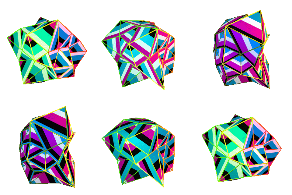
Improviz Gif by Antonio Roberts (Brought to you by Sharing is Caring .) 1. Of Robert's work, which makes an impact on you and why?  So far this Improviz Gif is making the most/direct impact on me. It is making me a little bit bonkers as it undulates and blasts color across this page and, consequently, my eyeballs. (It seems as though someone has turned off the sound for it.) I’d like to hear more explanation of the purpose and meaning behind the work. At face value I don’t derive much more than an “eye candy” experience from it. The whole concept of an Algorave is spectacular. I wonder about how much participants are really having to trust the coders. Because the sounds and visuals are not prescribed there is infinite variants. Exciting! You’ll never ever ever attend the same one twice! 2. How does Robert's work relate to the themes/topics that we have been learning about in this course? Technology is being utilised in a pure way- sometimes, apparently, the e